O-Class Whitelabel
This project is under an NDA, and all previews have been modified for confidentiality.
O-Class is an integrated software system designed to support class management for dance studios, tuition centers, gyms, and health clubs. O-Class has four core products: admin management site and app, as well as a client booking site and app. In this case study, the focus will be on the client app. The O-Class client app is one app for all the studios, where users can search for their studio name and log in using their studio specific credentials. This allows each studio to access its own environment within the same app.
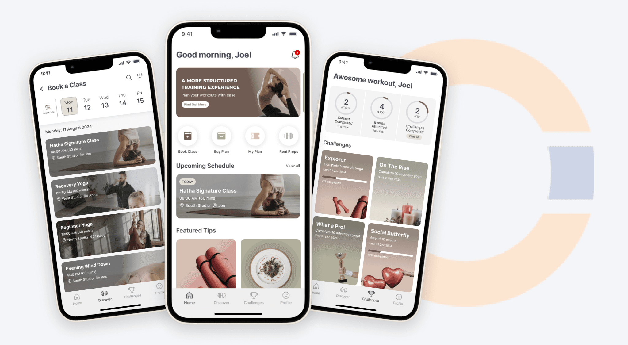
O-Class also provides a white-label service that enables studios to transform the app into a fully branded experience under their own identity. With this option, users don’t need to download the O-Class app, they can directly download the app under the studio’s name. This project focuses on customising the student booking app to align with a yoga studio’s brand. The work included adapting the visual identity, improving user flows, and adjusting specific menus to match the features offered by the studio.
Sector
Class Management System
My Role
Lead UI/UX Designer
Team
2 designer, 2 developers, 2 SQA
Timeline
Jun 2024 - Sep 2024
My Role
As the Lead Designer, I was responsible for the overall design and UX direction. Together with my design team, we gathered detailed requirements from the yoga studio, understood their needs, and ensured the app aligned with their brand identity. I also led the decision-making process for integrating the studio’s brand elements such as colors, typography, and visual tone, while improving the user flows and adjusting specific menus to align their services. I also had to ensure that all customizations stayed consistent with the O-Class client app, so the design wouldn’t break the overall product standards and would remain easy to maintain during future updates.
Discover
The first phase focused on understanding the yoga studio’s goals for launching their own white-label mobile app and identifying what was needed to transform the standard O-Class experience into a fully branded product.
Activities:
Gathered client requirements for branding, user behaviour, reviewing current website and content updates.
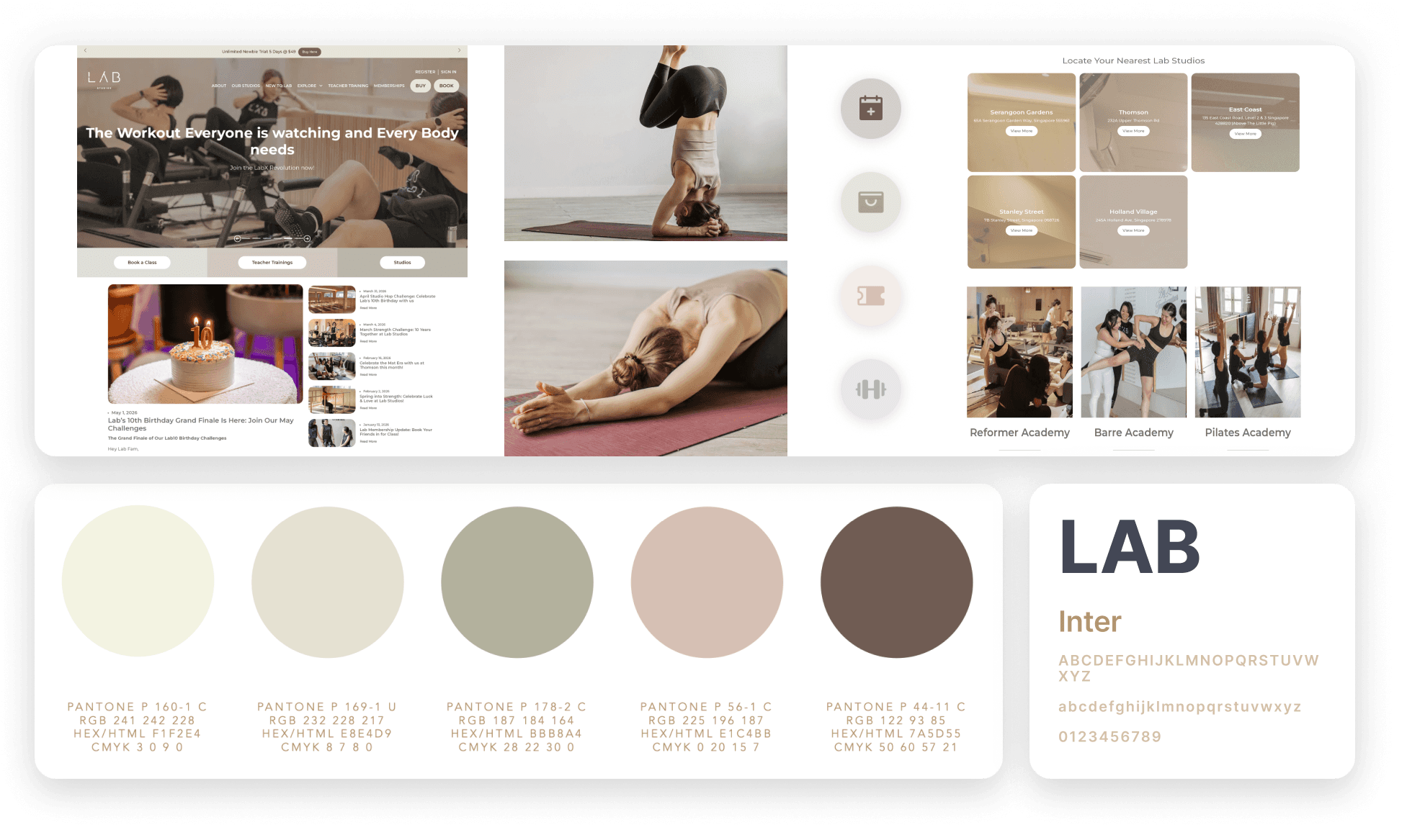
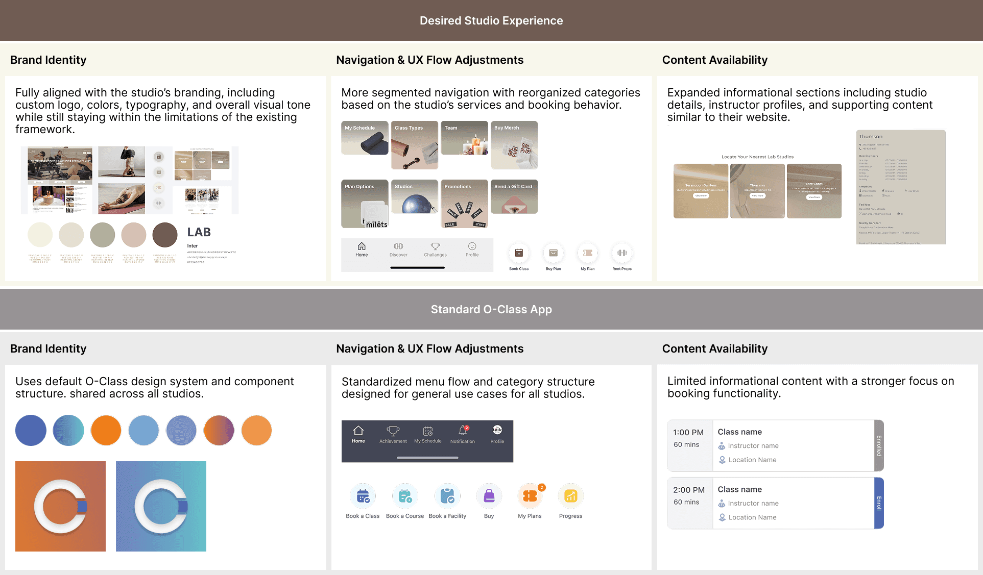
Identified gaps between standard O-Class experience and white-label app experience.
Analyzed and identified user journey and information architecture for new white-label app.
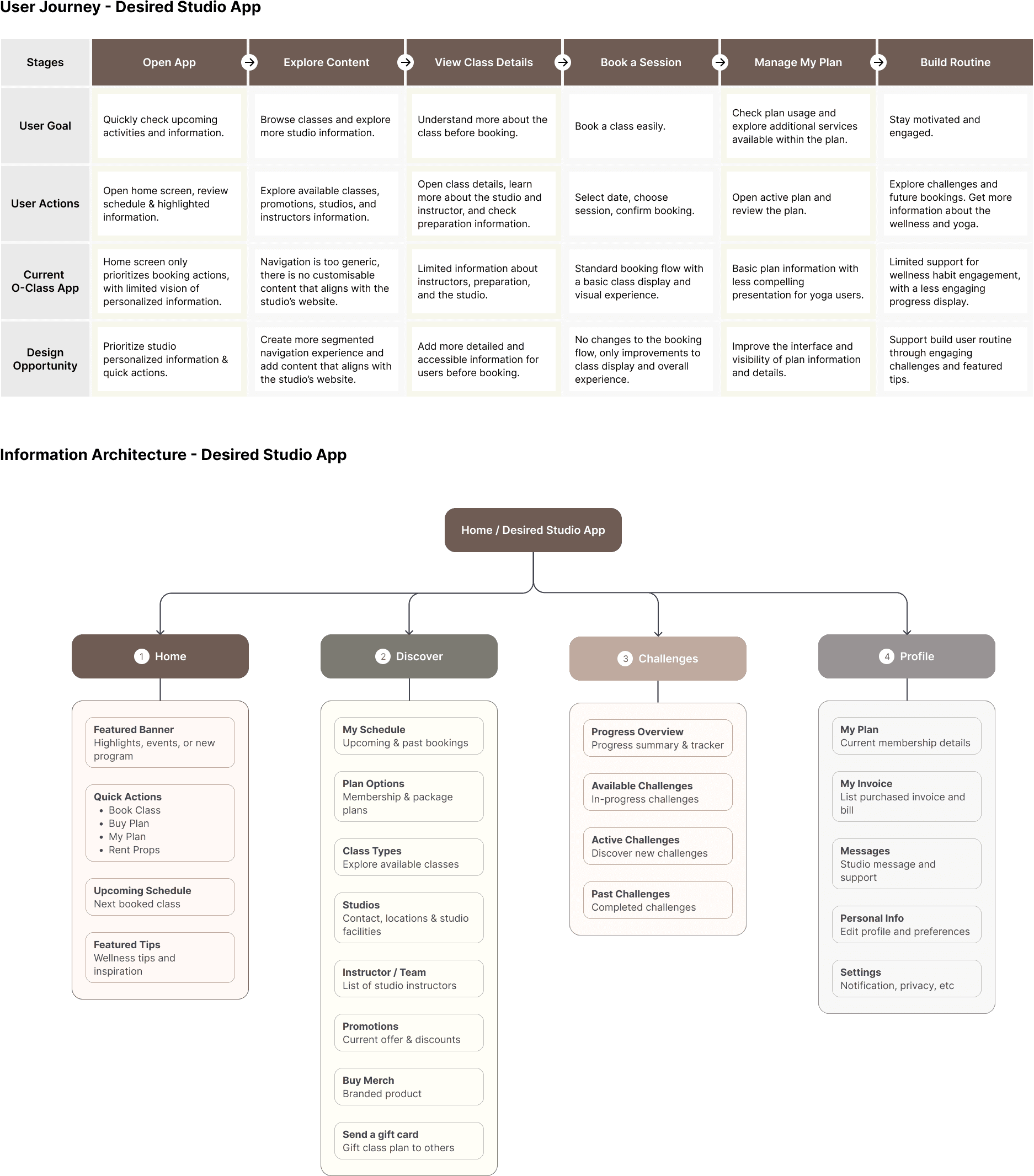
Identified technical limitations within the existing O-Class framework.
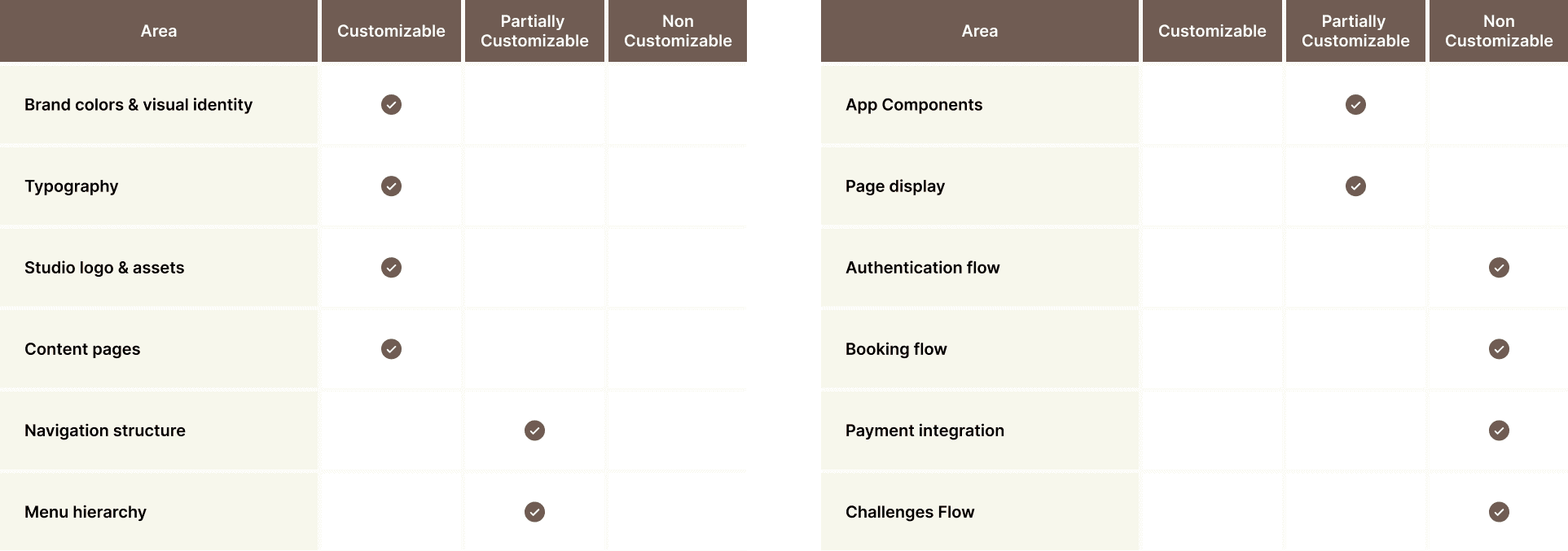
Problem Statement
The first phase focused on understanding the yoga studio’s goals for launching their own white-label mobile app and identifying what was needed to transform the standard O-Class experience into a fully branded product.
Brand Identity Alignment
The studio required the app to fully reflect their brand, which included updating the logo, colors, and typography. The main challenge was adapting these elements into the existing O-Class design system without changing much structure.
Navigation & UX Flow Adjustments
They requested changes to the standard O-Class menu flow to make it more segmented and easier to browse based on their use case. This involved reorganizing categories, adjusting the menu hierarchy, and revamping the layout so users could quickly access the yoga studio’s features.
Additional Content & Feature Expansion
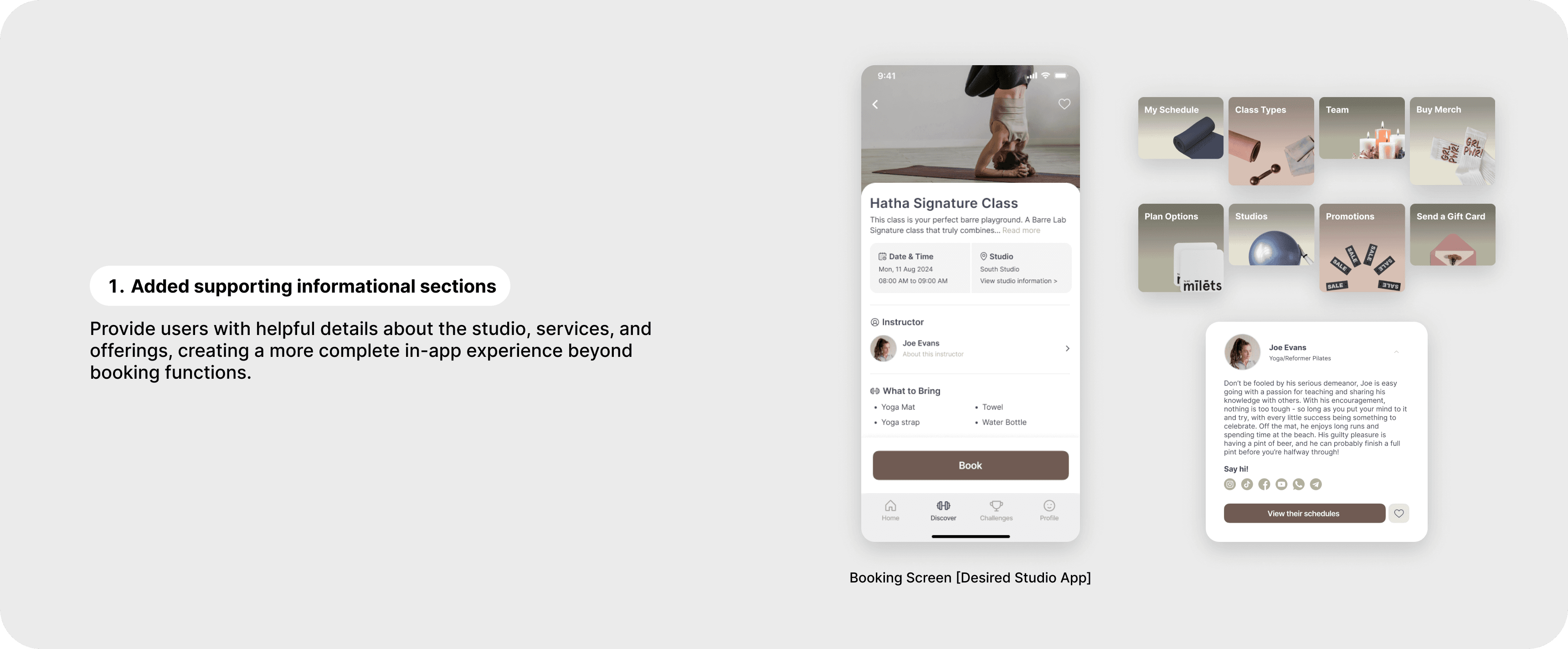
To match the experience of their website, the studio needed more informational sections inside the app. This required adding new content such as studio details, instructor profiles, and other supporting information while keeping everything aligned with the limitations of the existing O-Class framework.
Solutions Discovery
Based on the client’s requirements and a review of the existing O-Class system, I identified key opportunities to build the white-labeled app experience while maintaining the scalability and consistency of the existing O-Class system.
Customized the app branding through logo, colors, and typography to align with the studio’s visual identity, while reusing existing O-Class components and adapting their styling where possible.
Reworked navigation to create clearer booking flows based on the client’s daily needs and operational use cases.
Added supporting informational content outside the main O-Class flow to mirror the experience of the studio’s website, while keeping the main booking journey unchanged.
Maintained scalability by designing within the existing O-Class system, ensuring the main user flow remained consistent with the original O-Class system.
Design Exploration
During the this phase, I used Atomic Design principles to efficiently customize the white-label app through reusable components and scalable layouts.
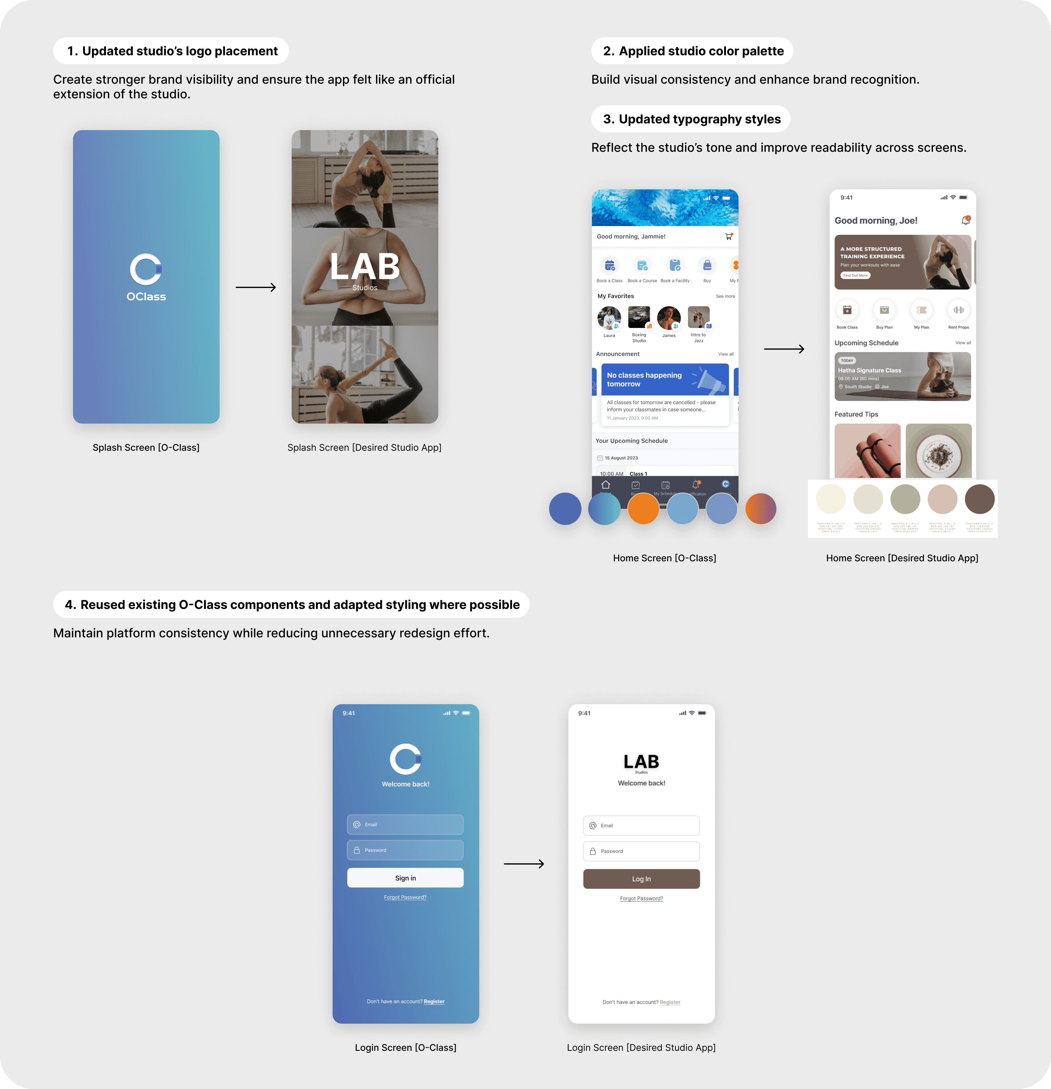
1. Brand Customization
Using existing UI atoms such as buttons, typography styles, icons, and color tokens, the app branding was updated to reflect the yoga studio’s identity.
Outcome:
Delivered a stronger branded experience without rebuilding the interface system.
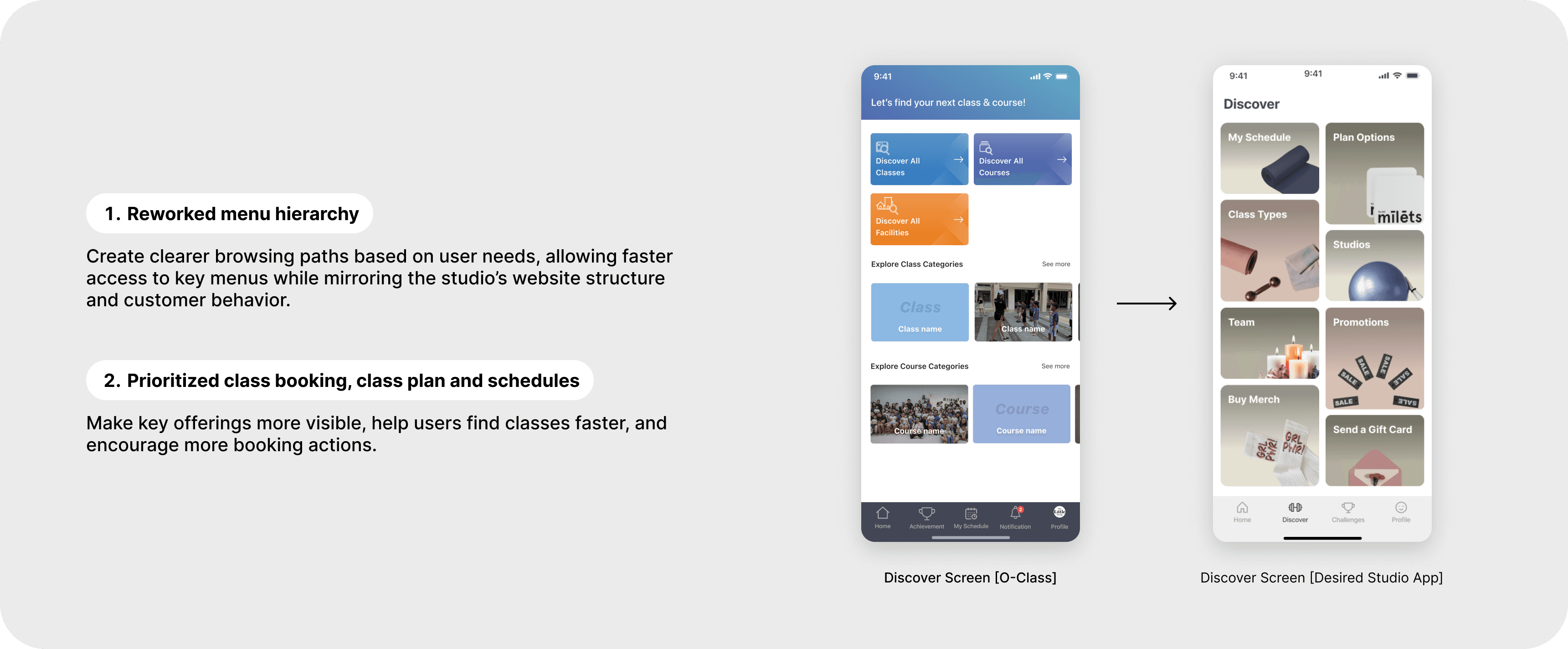
2. Navigation Improvements
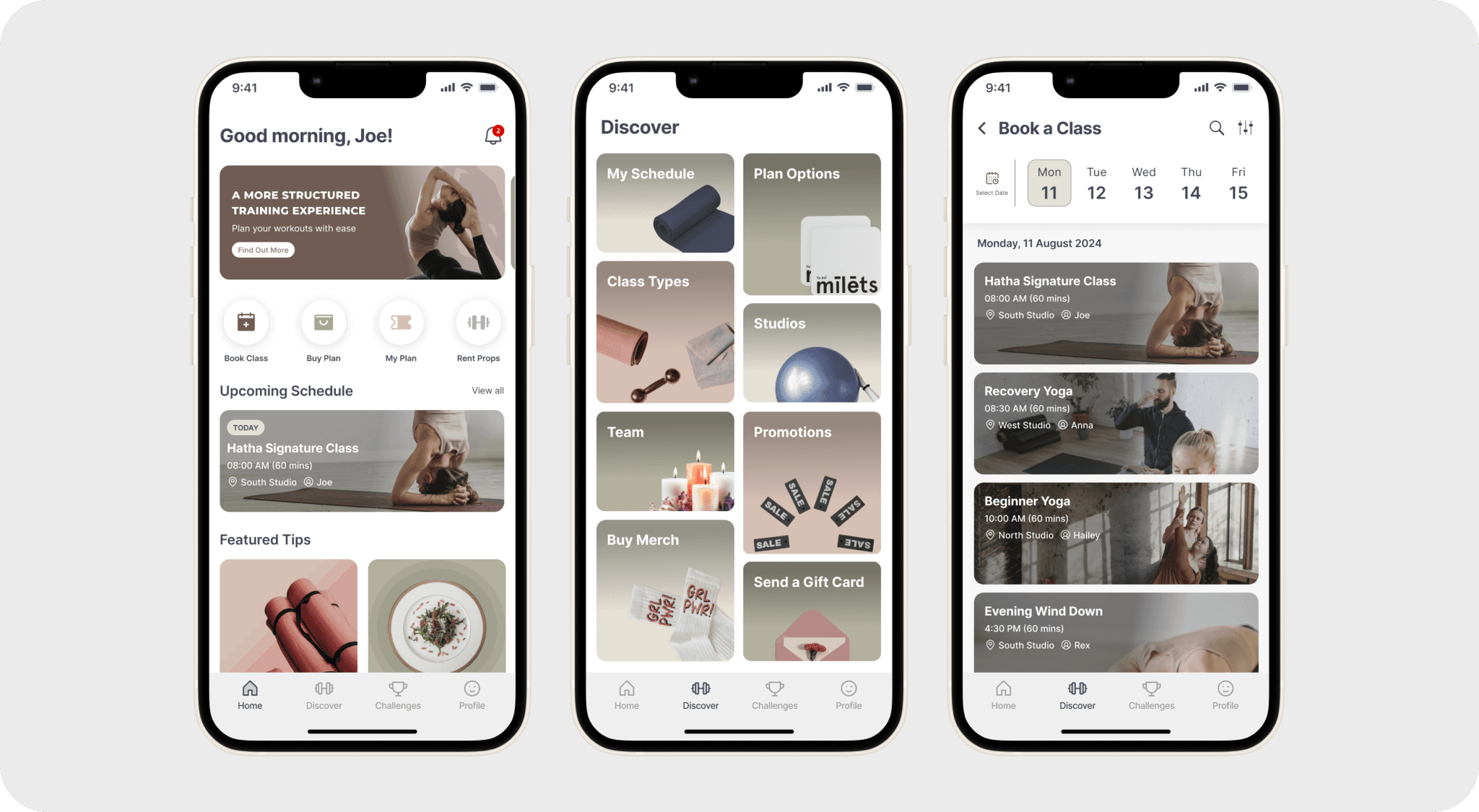
Using existing molecules and organisms such as menus, cards, and navigation groups, the browsing experience was restructured to better fit the yoga studio use case.
Outcome:
Users could navigate faster and access high-priority features more efficiently.
3. Content Expansion
New templates and pages were introduced to provide richer informational mirroring to the studios website.
Outcome:
Users could explore the studio experience directly inside the app.
4. Scalable System Thinking
To ensure long-term maintainability, all solutions were built within the existing O-Class framework.
Kept the main flows such as authentication, booking, and payment aligned with O-Class standards.
Reused components before creating new ones.
Minimised unnecessary structural changes.
Outcome:
The final solution remained scalable, consistent, and compatible with future platform updates.
Final deliverables
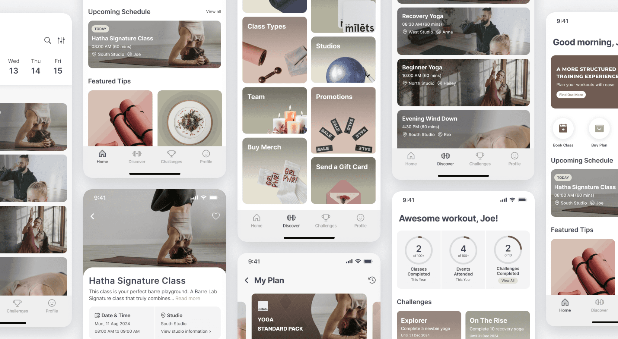
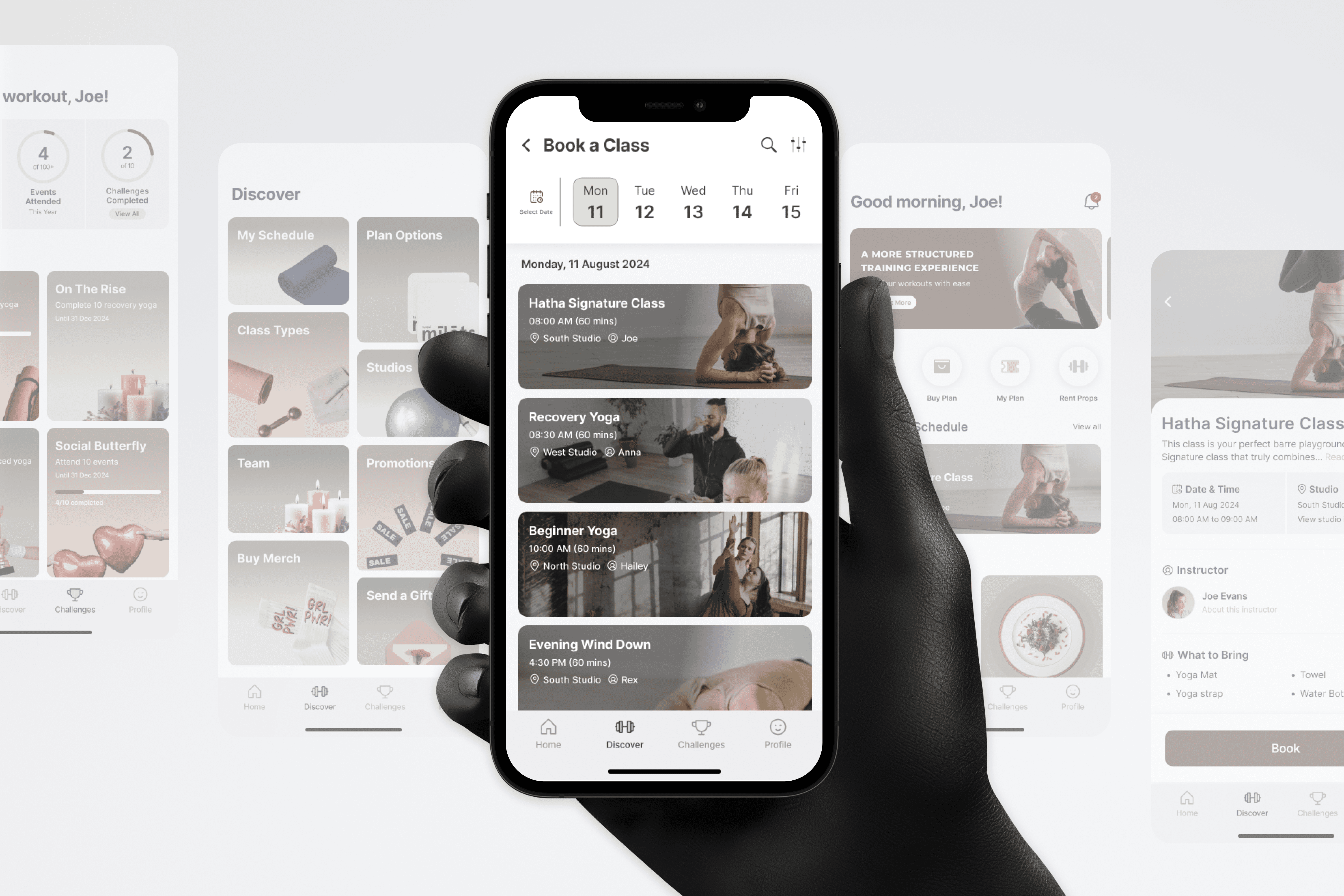
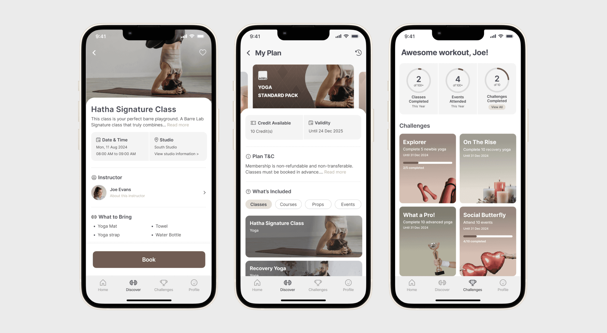
After completing the design exploration and refining the proposed solutions, I finalized the white-label app experience based on brand alignment, usability, scalable components, and platform consistency. Below are the final design screens that showcase the complete customization across key pages of the app.
Final Thought
Revamping this white-label booking app wasn’t just about updating the interface, it was about creating a branded digital experience that truly reflected the yoga studio’s identity while improving usability and preserving the integrity of the existing O-Class platform. While working within the limitations of an existing framework, every enhancement was designed to create meaningful impact for both users and the platform. This project demonstrated how thoughtful product design can balance customization with scalability, delivering a tailored client experience without compromising long-term maintainability.